
Checklist for editing web page content
Below is a reminder list of things to think about when editing your content. Run through your content as if it's the first time you've ever seen the page.
☐ Grab attention from the start
- Headings should clearly state purpose.
- Avoid sentences like "Innovative new program..." and instead state what and how the program will affect the reader. Example: "First 5 Investment Last a Lifetime"
- Keep the opener brief and to the point. 3 to 8 bullet points at the most.
- Less than a 3rd of readers scroll down a page so decide on the one thing you want them to know and put that first.
☐ Correct grammar and spelling
- Always run a spell check.
- Common places misspellings happen are on graphics
- Check your social media posts.
☐ Avoid "click here", "learn more", etc.
- Commands above do not tell the reader what is actually in the link
- Search engines will give a bad score to a site who has too many "click here" links.
- Instead make the link descriptive, for example: "visit the LMC library to use their news databases"
☐  Pictures should help you
understand the text
- If you can't describe the purpose for the chosen image then choose another image that better backs up the message on the page.
- Images need to load fast so the reader doesn't have to wait for the page to load. See the technical section for more on this.
☐ Deliver what you promised in your title
- Tell the reader how after you've told them what. Ex: "What’s in it for Early Childhood Professionals?"
- Research ads validity. For example If you claim you can make a lot of money at a profession then back it up with industry statistics.
- Examples in the form of bullets or graph ad visual interest.
- Experts and alumni quotes provide an extra validity.
- Other articles on the topic written by experts.
☐ Avoid jargon
- Always define acronyms. Ex "The Professional Development Program (“PDP”)"
- Define an acronym on each page because you'll never know which page a user will enter on.
- Specialized or technical language that is only understood by those who are members of a group, club or who perform a specific trade can quickly alienate someone who is trying to learn more about a program.
- Shorten your sentences by eliminating any unneeded words and phrases. Big words are for term papers.
- If there is a simpler way to explain do it.
☐ Show your personality
- College can be a scary place. Portray LMC as a warm and welcoming place not stuffy and unapproachable.
- Swap out passive voice for active voice
- Delete areas of repetition
- Use second-person voice to appeal to readers
☐ Support your claims with evidence
- Success stories are still popular with parents and students.
- Show pictures of past events and achievements.
- Highlight benefits of our unique programs.
☐ Solve problems of your target audience
- Assume the reader just landed on your page
- Tell the reader the next step
- Don't rely on color to convey the message
- Don't have your message only in an image. Always have a text alternative.
- Always have a contact so the reader knows there are real people behind this website!
☐ Reduce the clutter
- Refer to what your number one message you are trying to convey.
- Resist the temptation to get every single point across on the first page.
- White space is not lost space. It is just as much a design element as actual content.
☐ Reduce the clutter
- Refer to one focus message you are trying to convey.
- Resist the temptation to get every single point across on the first page.
- White space is not lost space. It is just as much a design element as actual content.
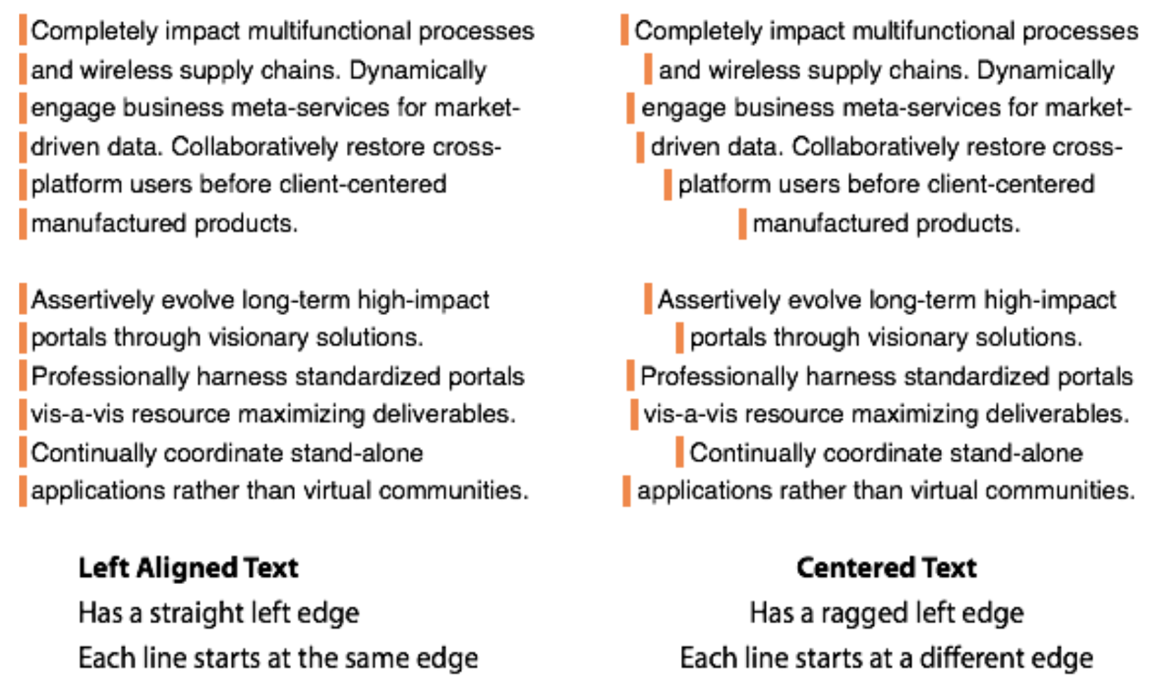
- Avoid centering - this only creates eyeball confusion.
☐ Everything should be easy to read
- Unobtrusive background
- Appropriate font types and sizes
- High contrast between font and background
- Links visually stand out by bolding them
- Make your links descriptive and do not use the words click here or learn more as a link.
- Too many links on a page can overwhelm a user link strategically
- Post text is well-formatted and scannable: Headings & Short paragraphs
- Text highlights (bold, italic, etc.)
- Lists / bullet points (less than 8 and more than 3 list items)
- Visually prominent quotes
- Create aesthetically pleasing design but do not sacrifice usability
Tip: Don’t overdo it. Too many images, whole paragraphs of highlighted text and endless bullet point lists achieve the opposite and make your visitors leave.
☐ Keep responsive design in mind
- Test your layout on a mobile view. Are the columns where you expected?
- Does the text still flow in a logical way?
- Are the images too large or too small?
☐ No Interruptions
- Is your design detracting from your message?
- Make sure your videos do not auto play
- Are their too many ads on your page (social plugins, animations, slideshows etc.)?
- Are your forms overly long?
- Do you have a popup? Why?
☐ Links
- Our system doesn't automatically bold links so after you make them get into the habit of bolding them to make them stand out in the text.
- If you're creating an event make sure to schedule when the event comes down to return the page back to normal when the event has passed.
☐ Size images correctly for the web
- Unless you're uploading an image for a huge slider or background image, keep your images below 1,000 pixels wide. Focus on image compression and overall dimensions so that you end up with an image that looks good, but at the smallest possible file size.
- Lowering the compression quality of an image won't be noticeable until you get close to 50%. Keeping your images around 60-70% will not only lower the file size, but it will keep your images looking sharp on the web.
- If your image files are several MB's, they are too big. Aim for something smaller, there really isn’t any reason why most images can’t be under 200KB.
- You can use picresize.com to reduce the size of an image or resizeimage.net to an exact size if you don't have Photoshop. You can also sign up for an education pro account with canva.com to get these and other editing features.
☐ Headings, when in doubt use the following rules:
- Heading 1 is used only once per page. It the red head a the top so chances are you'll never use it.
- Heading 2 is used sparingly as a subheading to identify the page.
- Heading 3 is used as a subheading in a chapter of Heading 2 and so on.
- Never skip a number. For example never follow a heading 1 with a heading 3.
☐ Embedded content
- Always provide an alternative way a reader can understand your embedded content. This applies to youtube, spreadsheets etc.
- If embedding a graph in an image form you must also provide a transcript of what that
graph is trying to convey.
- TIP: you can use the "image transcript for accessibility" component to aid in creating a companion transcript.